
Is There A Letter More Lovely Than K?
I have a new neighbor at The Fort. Okay, kinda new. Kate Sweeney moved in late last year. We talked about a logomark for her door.
“Could it be the lovely letter K?,” I asked.
“Yes,” said Kate.
We talked about her photography process and inspiration. This logomark needed to be playful, expressive, natural. And visually strong, with a presence… an attitude.
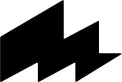
I have a problem: I’m addicted to lettering. And if you allow me to draw certain letters—like a capital K—it’s quite likely that I will spend gobs of hours sketching, playing and noodling over the shapes of that letter. I love so many letters, but is there a letter more lovely than K? The arms outstretched, welcoming you, reaching. Symmetrical, but not completely. All the ways the arms can be drawn. Rabbit hole? You betcha.
Below is a tiny glimpse into the process: an early sketch in Procreate, the final vector, with Decimal setting the signature’s typography. And the final vinyl on her door.
We swapped services, design for photography. Below is a peek into that shoot, with raw flowers and body paint. Kate’s down-to-earth nature, spontaneity and trust in natural light made this ‘shoot fun—book with her, and stop by my cave and say Hey.
