

Brand Design: Lundberg

Signature (logomark + wordmark) for Lundberg Industrial Arts
The best decision…
The best decision Andrew Lundberg ever made was to trade his golden handcuffs for a silver Airstream. For years, Lundberg had a well-paying job as a design director for a Columbus advertising agency and a comfortable townhouse in German Village. Life looked good from the outside. Inside Lundberg, though, was the soul of an artist yearning to escape the corporate world. The notion that he wasn’t producing anything tangible haunted him. "I would shut my monitor off at the end of the day and think, 'I didn’t bring anything to life,’” he said. “I didn’t want my life to be on a memory stick. I wanted to bring something out that you could touch and feel.”
— Ken Gordon, Columbus Dispatch

Andrew Lundberg, founder of Lundberg Industrial Arts
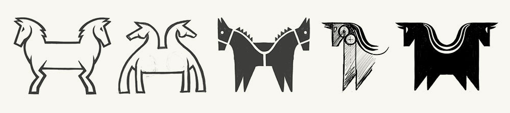
Sketches for Lundberg’s Two-Headed Horse concept

Exploring the horse’s stance relative to the big idea

Adding strength and beauty
Prior to our identity work for Lundberg Industrial Arts, Andrew Lundberg established equity in a two-headed horse illustration. It was strong conceptually and visually, and a landmark outside his shop. We were thrilled to know the two-headed horse concept would carry forward, and we were challenged to design it as a modern logomark.
Designing original marks of common animals is a daunting task. They've been well designed already—over and over. So we explored lots of directions, from eclectic to primitive (reminiscent of cave drawings). Farther along, we explored leg and hoof design, discussing how each communicated the Lundberg story (good and bad). Details mattered, too: bridled? saddled? spurs?
The more we added, the more we knew it was wrong, and Janet's creative eye was critical in defining what mattered most:
"Some of these look regal, like they're prancing. That's not Andrew," she said. Janet steered us to the heart of Andrew's aesthetic vision: Refined yet untamed, a balance of strength and beauty.
ICYMI: The wordmark
The identity's wordmark also captures the big idea: the mirrored, lower case "d" and "b" in Lundberg reflect the mirrored image of the horses, allowing the type to stand alone as a simple, yet highly defensible part of the brand.
And one more thing: the "silly small" size test. All marks by Menges Design must pass it. Which means the logomark and wordmark—and their combination in a signature—must be legible at the smallest possible sizes. Like avatars for Instagram and Twitter. It's more than a scale test. It's effective, flexible, hard working design.
Can your logo pass that test? If not, we can help. Contact us...
More about Andrew: Lundberg Industrial Arts
